The Psychology of Color in Branding: How It Shapes Perception and Behavior
The Psychology of Color in Branding Colors shape how customers feel about your brand. Discover how to choose your palette strategically.
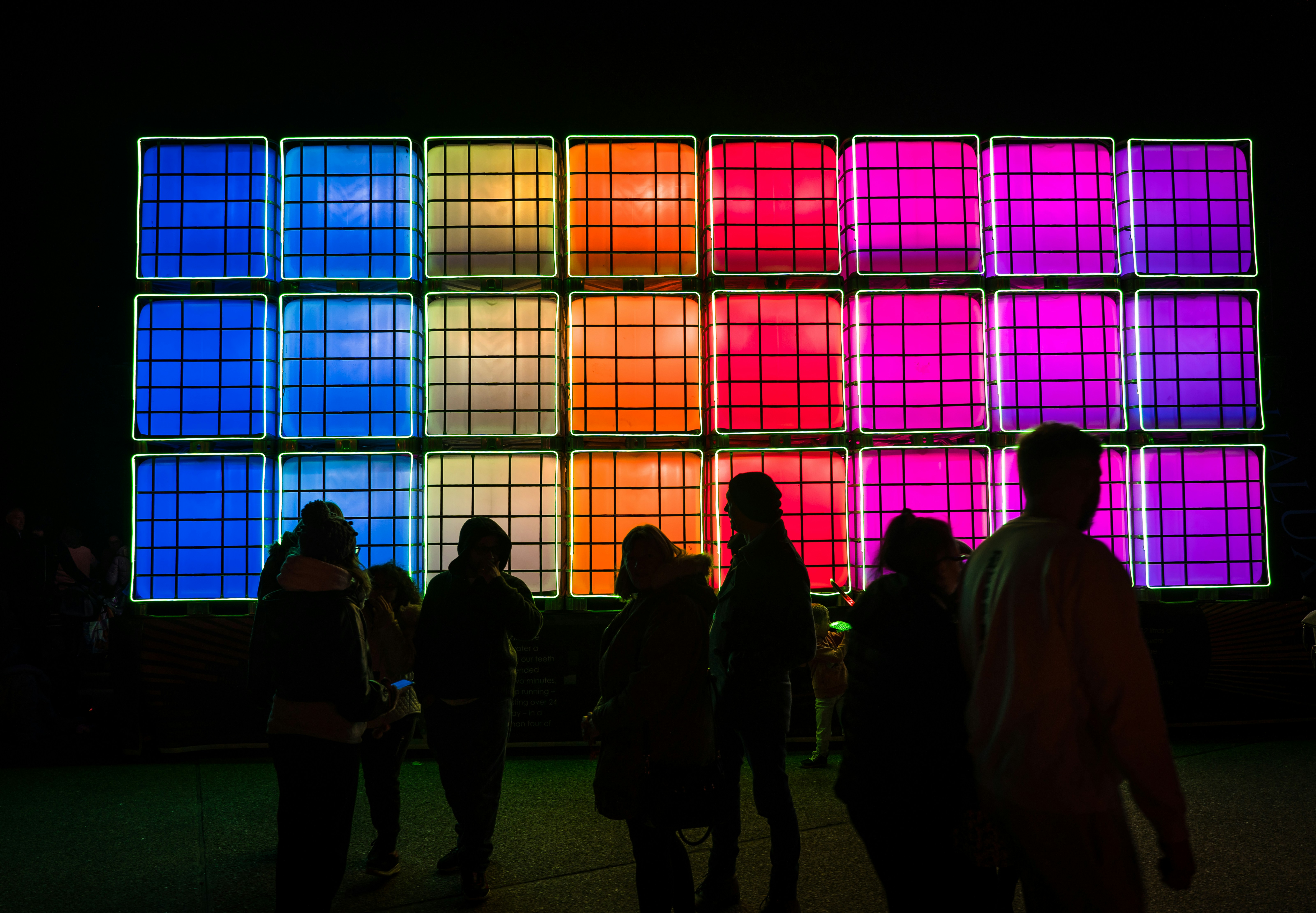
Colour is one of the most powerful and underestimated tools in a designer’s toolkit. Long before a customer reads your tagline or scrolls through your product catalogue, they’ve already responded emotionally to your colour palette — often without even realising it.
This isn’t abstract theory. Colour psychology is a well-researched field, and its implications for branding are concrete and measurable. Choosing the right colours for your brand isn’t a matter of personal taste — it’s a strategic decision that shapes how your audience perceives and interacts with your business.
Why Colour Carries Meaning
Humans are wired to respond to colour. Evolutionary biology, cultural conditioning, and lived experience all feed into the associations we instinctively attach to different hues. Red feels urgent and energetic. Blue feels calm and trustworthy. Green evokes nature and growth. Yellow radiates warmth and optimism.
These associations aren’t universal — they can shift across cultures — but within any given market, they’re remarkably consistent. That consistency is what makes colour such a reliable lever for brand communication.
The Colours and What They Communicate
Blue — Trust, Reliability, Authority
No wonder it’s the favourite of banks, tech giants, and healthcare brands. Blue communicates dependability and calm expertise. Brands like IBM, Facebook (Meta), and PayPal have all leaned into blue’s trust-building properties. If your business needs to project credibility above all else, blue belongs in your palette.
Red — Energy, Urgency, Passion
Red is action. It speeds up the heart rate, stimulates appetite, and creates a sense of urgency — which is why it’s ubiquitous in fast food, sale signage, and entertainment. Brands like Coca-Cola and Netflix use red to create excitement and immediacy. Use it to drive action, but use it sparingly — too much red can feel aggressive.
Green — Nature, Growth, Health
Green is the natural choice for wellness, sustainability, and finance brands (money, after all, is green). It carries associations of balance and renewal, making it ideal for any brand that wants to communicate responsibility, health, or environmental values.
Yellow — Optimism, Warmth, Caution
Yellow is the most attention-grabbing colour on the spectrum, which is why it appears on warning signs and taxi cabs alike. In branding, it communicates friendliness and creativity — think IKEA or Snapchat. But use it carefully: too much yellow can feel overwhelming, and its high visibility cuts both ways.
Black — Sophistication, Luxury, Authority
Black signals premium positioning. It’s the backbone of luxury brand identities from Chanel to Apple. Used well, black communicates exclusivity and confidence. It’s also endlessly versatile, pairing powerfully with almost any accent colour.
Colour and Conversion
Beyond brand identity, colour plays a direct role in conversion rate optimisation. The colour of a button, a headline, or a form can meaningfully influence whether a user takes action. Studies in behavioural design have found that contrasting CTA buttons (call-to-action) can significantly outperform blended ones, simply because contrast draws the eye.
The principle isn’t ‘red buttons always win’ — it’s that the right colour in the right context creates the right response. Testing colour choices through A/B experiments is one of the fastest ways to improve conversion metrics on an existing site.
Practical Advice for Building Your Brand Palette
Start with your brand’s core emotion: what feeling do you want customers to walk away with? From there, choose a dominant colour that aligns with that feeling. Add one or two complementary secondary colours for variety, and a neutral (white, black, or grey) for balance and readability.
Keep your palette tight — three to five colours is usually enough. Consistency in how you apply those colours across your website, marketing materials, and product packaging creates the kind of visual coherence that builds instant brand recognition.
Final Thoughts
Colour isn’t decoration — it’s communication. Every shade you choose is sending a message, whether you intend it to or not. The brands that understand this use colour deliberately, strategically, and consistently — and the results show up in both perception and revenue.